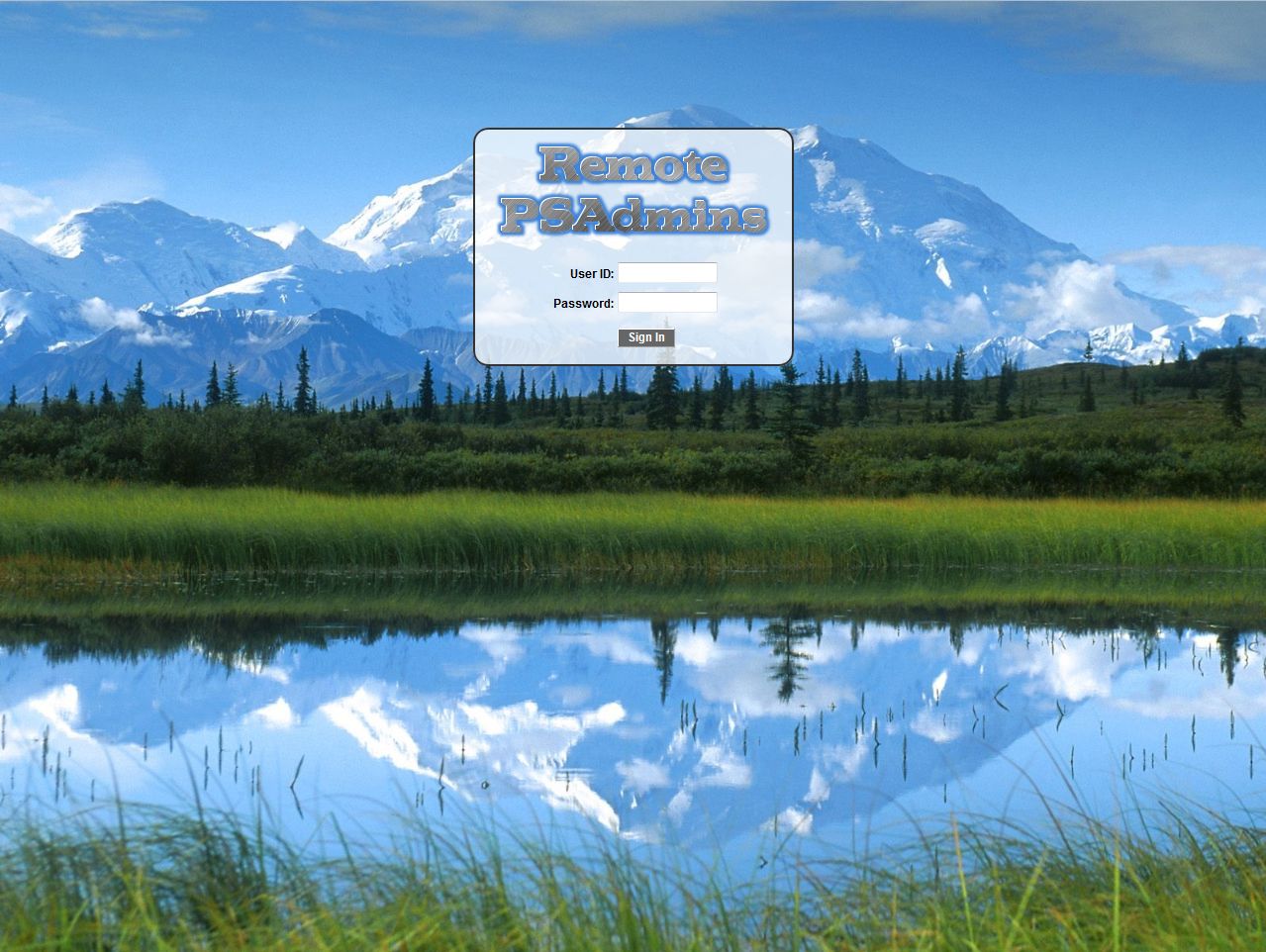
I had a few spare cycles the other day and decided I’d make the PeopleSoft Sign On page look a bit more attractive. So here’s a run down on what I did. All these changes are made in the signin.html.
- I placed a high res image as the background. It’s setup to resize to 100% of the browser window all the time. This has some downside if you want to use an image that needs to keep a specific aspect ratio. You can always change how it’s displayed though if you needed to keep aspect the ratio.
- Rather than utilize the table structure in the original page that PeopleSoft delivered I decided to start fresh. I replaced most of the existing table functionality with div’s although I still have the table used for the User ID/Password Sign In formatting. I thought about changing the look of the User ID/Password text boxes but maybe I’ll tweak that later and post an update later.
- I added transparency to make it look good with the background and gave it a smoother look with curved border corners.
- I left out the trace flag and languages sections. I might add the trace flag section back in as some type of options tab that would replace the sign on page for tracing. I could also do something similar for the languages piece so it’s there but not always in the way. If I make those changes I’ll post an update.
- I removed the default logo and added a custom logo. Lots of places already do this, but they leave most of the rest of the page alone.
- I kept all the dynamic variable stuff, so errors are all properly displayed. I could pull the error out and display it somewhere else. In this example though I didn’t really have anywhere better to put it so I left it where it is.
- I placed the new custom images for the log in on another server and referenced them from the sign in page.
Here are two screen shots, one as is, and one showing an error.


Leave a Reply